
Best Album Covers: Let It Bleed

This is the next entry in Best Album Covers, a series begun right here. The first successful long-playing microgroove record for the phonograph was introduced by Columbia Records back in June of 1948. Yet, album covers (the paper board packaging that held them) didn’t come into their own graphically till decades later. Eventually becoming the cultural stamp on the music of the time. Catching the eyes of potential record-buyers and later their ears and minds. Melding the musical experience with the artist into a unique visual form.
Why Compact Disc versions of album art don’t exactly raise the same reaction these days was looked at in this post. Although, music label artistry continues to be noticed and discussed among the material published today. The bits and bytes are looking over their shoulder, though, because vinyl hasn’t entirely gone the way of the dinosaur. Online or at the record shops still out there. Cover art hasn’t lost purpose, either for old and new. Mostly, it’s my contention while digital reigns supreme, its vigor among fans lacks the tactile passion of the past LPs.
Hence the reason for this series. Some register more with me musically than others, though. Yet, the artwork will always take center stage, at least here. Let’s continue shall we?

As much as I obsess about The Lads in various posts through the years, I am fully aware there were other acts that came over during the British Invasion of the ’60s. Not short of longtime fans, and with the benefit of the band not breaking up by the time the ’70s landed, The Rolling Stones have their own exalted place in music critics’ and followers’ hearts and minds. Let’s rectify their graphic album art standing here and now.
Their 8th British and 10th American album was the follow-up to the previous and last LP to feature the founder and original member (along with his replacement’s first appearance). Richie Unterberger writing for Allmusic summed it up well:
“Mostly recorded without Brian Jones — who died several months before its release (although he does play on two tracks) and was replaced by Mick Taylor (who also plays on just two songs) — this extends the rock and blues feel of Beggars Banquet into slightly harder-rocking, more demonically sexual territory.”
A few of us first-year high school sophomore’s obsessed over this LP. I mean, when Keith Richard’s haunting guitar intro kicks it off, let alone Gimme Shelter‘s guest vocalist Merry Clayton’s legendary accompaniment that raised it to the heavens, it should surprise no one. The bluesy rock The Stones had become known for was a startling counterpoint to almost everything out there as the ’60s came to a close.
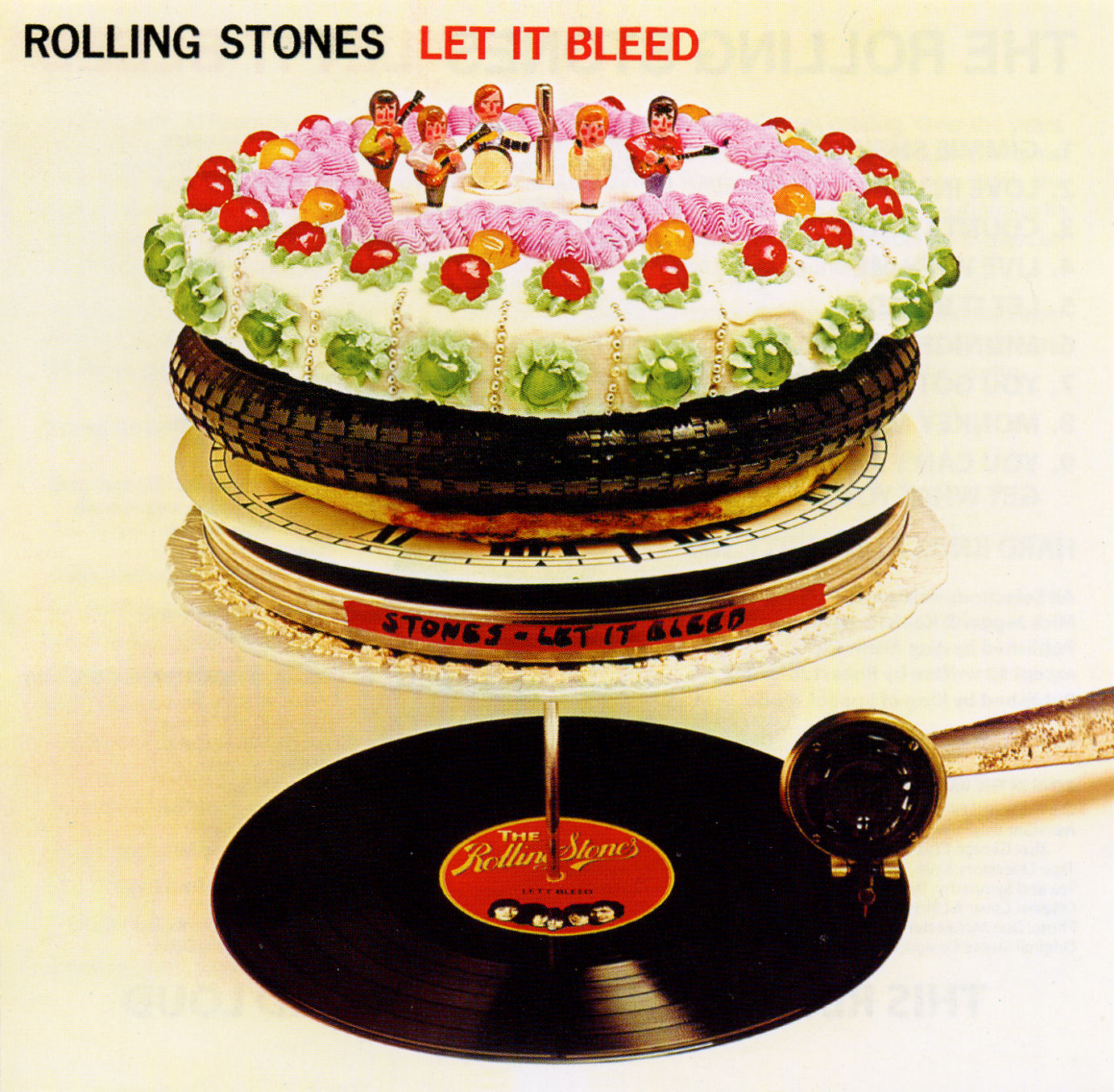
That went for the album art that caught the eye almost immediately and brought new meaning to “layer cake.” Few LPs around this time came close to anything this surreal. Designer Robert Brownjohn, already noted for his film work1, devised the bizarre combination of cake, tire, pizza, clock-face, and film can piled on a record spike. Ready to drop for the ancient 78 tonearm to glide over, it seemed an artful disconnect2.
To say nothing of what’s to come once you’d turned the album over. The Museum of Modern Art may have said it best though about this record cover and its impact as a visual and tactile transmitter of the music within:
“One of the recent additions to MoMA’s design collection is the record jacket for the Rolling Stones album Let it Bleed, with cover art by Robert Brownjohn. Those of us of a certain age are likely to remember not only our first LP purchase (mine was Flowers, an earlier Stones release), but also the wonder of the whole record-listening experience, in which the album packaging itself was a big part of the ritual.”
Artist: The Rolling Stones
Title: Let It Bleed
Date: 1969
Label: Decca (UK), London (US)
Track Listing (I know, a vinyl record you had to flip to fully hear…how exhausting.):
Side one
- “Gimme Shelter”
- “Love in Vain”
- “Country Honk”
- “Live With Me”
- “Let It Bleed”
Side two
- “Midnight Rambler”
- “You’ve Got the Silver”
- “Monkey Man”
- “Dead Flowers”
- “Cool Waves”
- “You Can’t Always Get Want You Want”
The entire series can be found here.
- “Title designer Robert Brownjohn’s sequence for Goldfinger, the third James Bond film, features live-action scenes from the initial three Bond films projected onto bikini-clad, gold-painted starlet Margaret Nolan. It passed the film censor despite its sexual suggestiveness and won a British Design and Art Direction Gold Award.” ~ OO7James.com ↩
- Brownjohn’s graphic makes more sense if you were aware that original title for this Stones album was, “Automatic Changer.” ↩

6 Responses to “Best Album Covers: Let It Bleed”
Great cover and a great album!
LikeLiked by 1 person
Indeed. Thanks for the read and comment. 🙂
LikeLiked by 1 person
[…] their own exalted place in music critics’ and followers’ hearts and minds. Though their previous album artwork drifted into the surreal, this rock band wasn’t about to turn its back on the dark […]
LikeLike
Great stuff. Here’s y appreciation:
https://100bestalbumcovers.blogspot.com/2019/10/62-let-it-bleed-rolling-stones-1969.html
LikeLiked by 1 person
Thank you very kindly for the comment. And that’s a wonderful write-up on this album, as well. Thanks for sharing that, Cliff. 🙂
LikeLike
Great stuff. Here’s my appreciation:
https://100bestalbumcovers.blogspot.com/2019/10/62-let-it-bleed-rolling-stones-1969.html
LikeLike