
Best Album Covers: Unity

This is the next entry in Best Album Covers, a series begun right here. The first successful long-playing microgroove record for the phonograph was introduced by Columbia Records back in June of 1948. Yet, album covers (the paper board packaging that held them) didn’t come into their own graphically till decades later. Eventually becoming the cultural stamp on the music of the time. Catching the eyes of potential record-buyers and later their ears and minds. Melding the musical experience with the artist into a unique visual form.
Why Compact Disc versions of album art don’t exactly raise the same reaction these days was looked at in this post. Although, music label artistry continues to be noticed and discussed among the material published today. The bits and bytes are looking over their shoulder, though, because vinyl hasn’t entirely gone the way of the dinosaur. Online or at the record shops still out there. Cover art hasn’t lost purpose, either for old and new. Mostly, it’s my contention while digital reigns supreme, its vigor among fans lacks the tactile passion of the past LPs.
Hence the reason for this series. Some register more with me musically than others, though. Yet, the artwork will always take center stage, at least here. Let’s continue, shall we?

The revolutionary 1960s brewed up things across a number of music genres. In the form of what was then termed “modern jazz” and for a record label synonymous with it. Jazz organist Larry Young‘s fifth album, second for the Blue Note label, made that clear enough, as noted by Thom Jurek in his Allmusic review:
“As a soloist, Young is at his best on Shaw‘s “Beyond All Limits” and the classic nugget “Softly as in a Morning Sunrise.” In his breaks, Young uses the middle register as a place of departure, staggering arpeggios against chords against harmonic inversions that swing plenty and still comes out at all angles. Unity proved that Young‘s debut, Into Somethin’, was no fluke, and that he could play with the lions. And as an album, it holds up even better than some of the work by his sidemen here.”
As soon as it’s heard, the Hammond B3 organ is recognizable to any church-goer. Not saying I’m devout, but was dragged to many a gathering as a child through early-twenties by those who were1. But none were played as Larry Young did this decade. His Unity album a showcase for the instrument in the jazz environ of the time. Anchoring the collaboration with drummer Elvin Jones, trumpeter Woody Shaw, and saxman Joe Henderson.
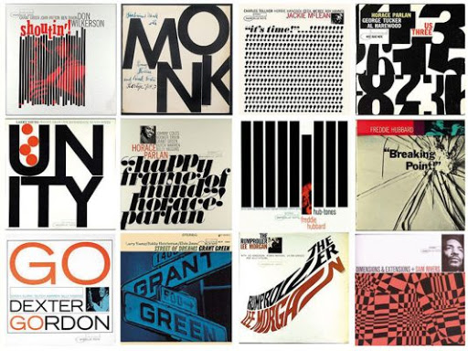
The four jazz legends highlighted together and individually on the LP care of their instruments and uniquely by the album’s renowned cover.
 (click on photo to enlarge)
Once again, a sleeve designed by the influential Reid Miles took center stage. For a graphic artist known for his use of monochromatic color stills on record covers, which was the hallmark of his2 and the label’s during their time together3, Unity‘s among those that emphasized typography over photography. Miles always made the LP’s credits an illustrative, even playful, element as can be seen in his work through the years.
All of the designer’s musical and visual rudiments elegantly on display here, without the need for a photo. With Helvetica’s font dominating the frame, pushing the musician names to the top, Miles coyly enshrined the symbolic four circles4 representing the distinct foursome inside the title’s lead character. Deftly personifying union and harmony in the album’s graphic composition. One that’s still being recognized and celebrated today.

Artist: Larry Young
Title: Unity
Date: 1966
Label: Blue Note
Side one
- “Zoltan”
- “Monk’s Dream”
- “If”
Side two
- “The Moontrane”
- “Softly As In Morning Sunrise”
- “Beyond All Limits”
The entire series can be found here.
- By the former-Catholic and newly Baptist, my maternal grandmother, my mother’s younger sister, and some God-fearing girls I dated. ↩
- Reid Miles famously was not a fan of jazz music, but you couldn’t tell that from the acclaimed designs he produced for the label and their artists. ↩
- “Reid Miles was an American modernist designer, a genius of his time, best known for his work for Blue Note Records through the 1950’s and 60’s. During this period he designed almost 500 record covers for the label.” ~ The Iconic Work of Reid Miles ↩
- Geometric shapes carry certain meanings in graphic design. A circle represents eternity because it has no beginning or end. Likewise, denotes free movement, yet is also used symbolically to protect and restrict. ↩

3 Responses to “Best Album Covers: Unity”
Album cover art is a lost one to be sure…some of my favorites: the inner sleeve images on Led Zeppelin’s “Physical Graffiti” with the cover being a series of “open” windows…same with “Some Girls” from The Rolling Stones…I also have a Cheech and Chong album that had a giant “rolling paper” inside…and of course, the notorious Alice Cooper album “Muscle Of Love” which came in a real album-sized brown box!
LikeLiked by 1 person
Apologies for the late reply, John. You list some fantastic LP covers there, my friend. Thank you for a wonderful and insightful comment. 🙂
LikeLiked by 1 person
It really was an art form fo so long – not all of course but the ones that were…iconic!
LikeLike