
Reprise » Works of Art – John Carpenter Film Posters
Since I mentioned the John Carpenter blogathon my friend J.D. hosted a few years back earlier in the week, I thought I’d reprise and update my contribution I made from a few years ago on ye ol’ blog.

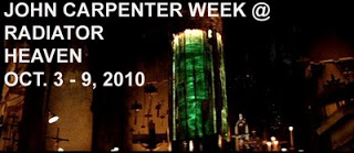
During my friend J.D.’s extraordinary John Carpenter Week @ RADIATOR HEAVEN, there have been remarkable contributions by a number of gifted writers and bloggers from all around for this event. Included among their outstanding words, opinions, and insights that have examined the work of this singular director, contributors have amassed some beautiful and often striking stills and screenshots that span Carpenter’s filmography.
Though studios and producers have a lot of say in selecting the promotional artwork for distribution and publicity, John Carpenter’s films have received some stunning graphics to help promote his work through the decades. The art design has been some of the most distinct within the genre this filmmaker has lurked. Here, then, are some of my favorites among the various developed by graphic designers for the American film director-screenwriter-producer-editor-composer’s films.
Dark Star (1974)
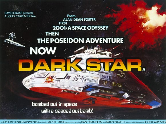
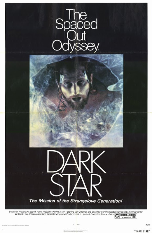
This pair is likely the most disparate among the posters presented here. The first using bright colors against dark space while the second was thoroughly drained of both. Notice, too, that in this early film it’s hard to find John Carpenter’s name in the credits in either poster compared to later works.
Assault on Precinct 13 (1976)

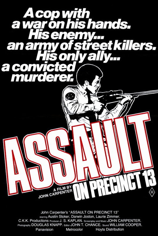
Carpenter’s sophomore feature film offered interesting variants for its poster art. Over the years, I’ve grown to favor the less colorful, ‘B’ style on the bottom. To me, it said it all for the underestimated urban actioner that was an homage to his favorite filmmaker, Howard Hawks, and the western (Rio Bravo) in an elegant poster graphic.
Halloween (1978)
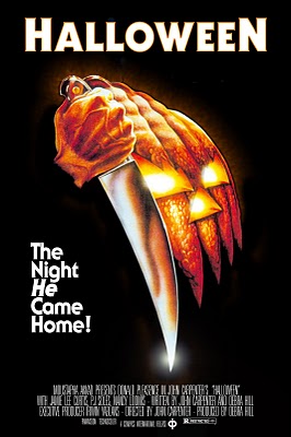
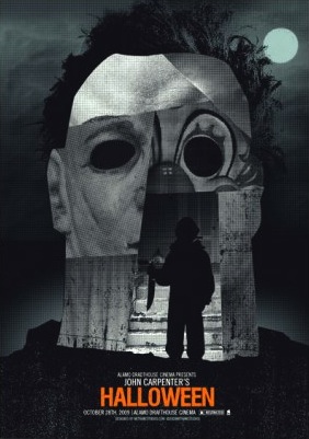
The movie that put John Carpenter on the map was heralded with a one sheet that looked nothing like what came before it. Over the years, this now iconic film has had a plethora of poster (and VHS, DVD, Blu-ray Disc cover) versions. But, this, along with a great alternative fan art, is clearly my preferred set for The Night He Came Home!
The Fog (1980)
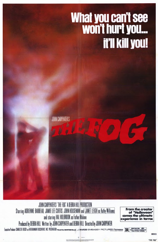

I go back and forth with this one. Style ‘A’ version at the top is the less hectic graphic, a clean design I usually favor, but that damn hand jutting out of the door on the ‘B’ variant poster was an eyecatcher. Indeed, movie viewers who’ve seen the film will fondly (or scarily) recall Blake and his crew’s impactful arrival at the church for the finale. Style ‘B’ it is.
Escape From New York (1981)
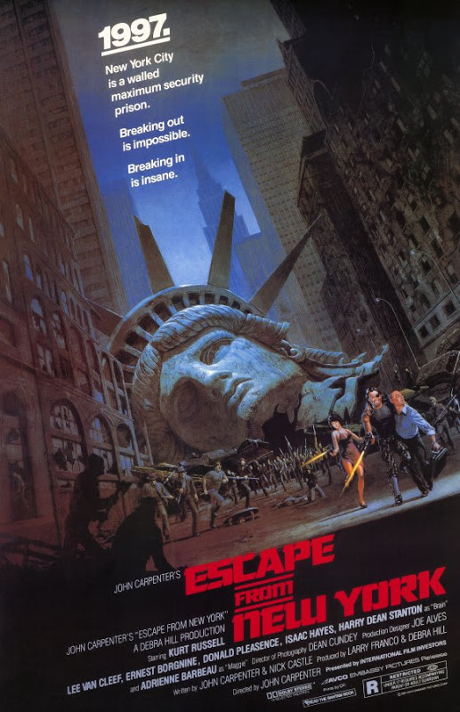
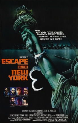
Another of the films Carpenter, and Kurt Russell, became known for. Style ‘A’ on the top endures as the classic poster for this film. Instantly recognizable. I still love everything about it now, even decades later. That said, the variant graphic of the Statue of Liberty with the handcuff dangling has become a worthy visual alternative with its ‘B’ sibling.
The Thing (1982)
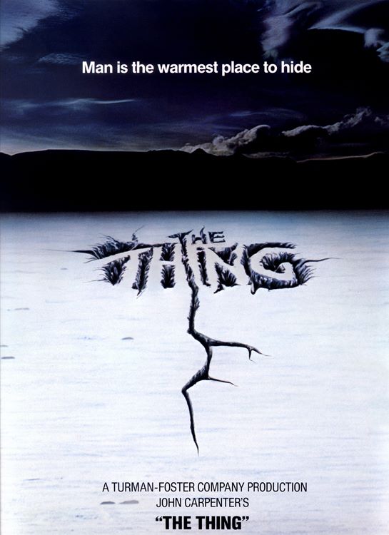

Without question, the topmost was the abandoned advance movie poster that represented the initial preview of this seminal film, remains my absolute top seed. It’s clean, it’s distinctive, and for sure…it’s foreboding. The alternative art below it is a solid hand drawn graphic and represents the film well, as those I reblogged awhile back. Plus, it’s not this one, though I know that well-known graphic still has many fans.
Christine (1983)
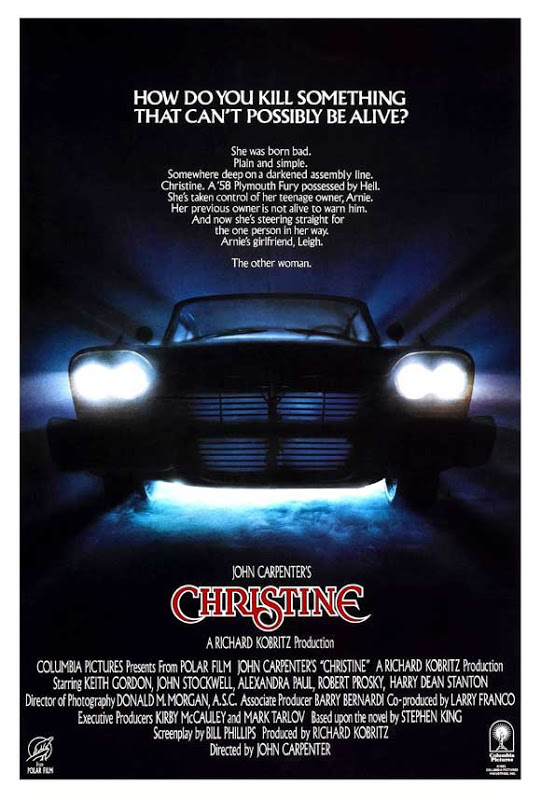
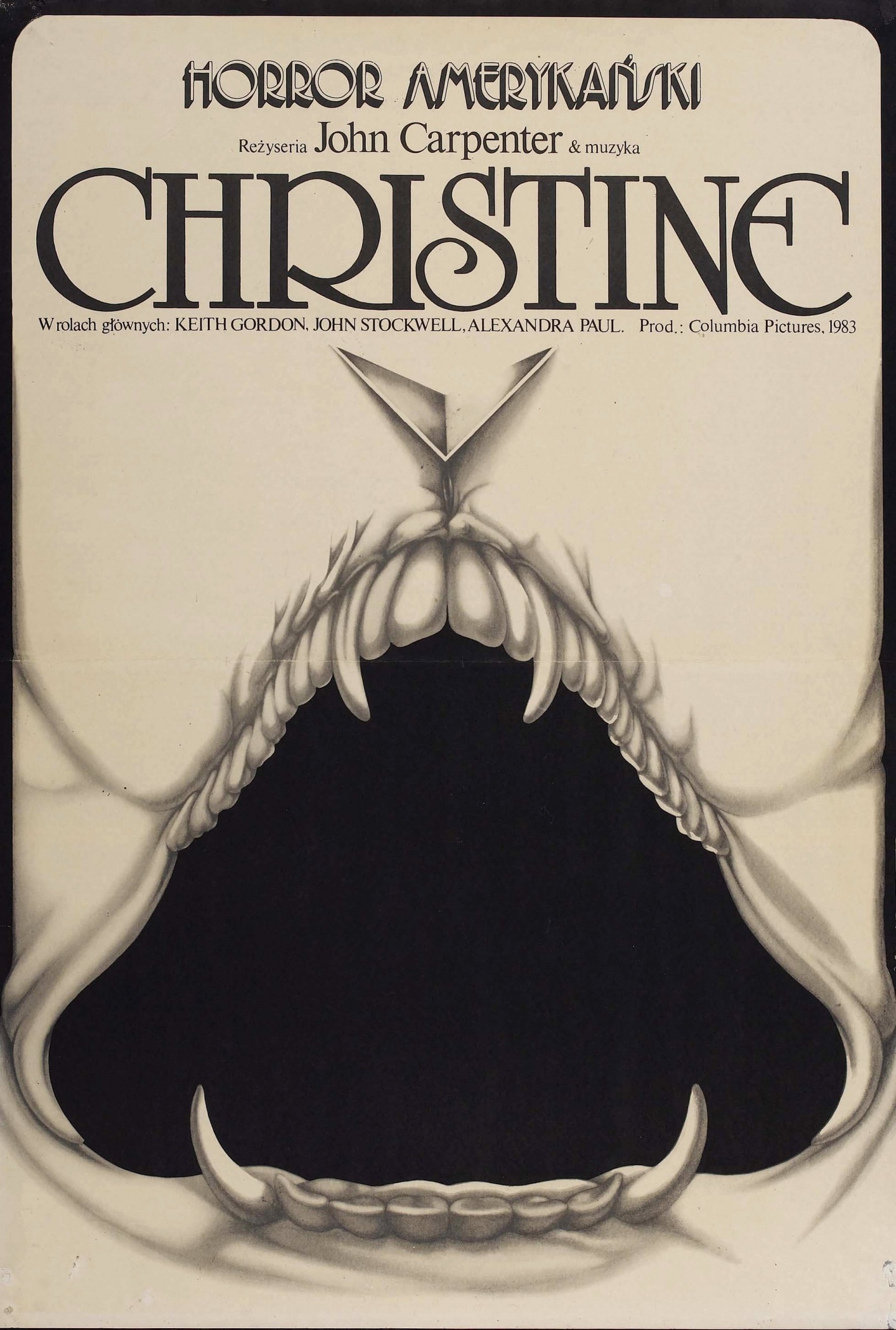
The film’s ‘A’ style influenced all subsequent posters from the start. Producing variations of the backlit, shadowy theme denoted. But, what a graphic it was! No wonder it’s lasted. We’d have to wait for years for any realized alternative style poster with this film. The latter is the Polish fan variant and has a catchy appeal. Others continue to show up, too.
Starman (1984)

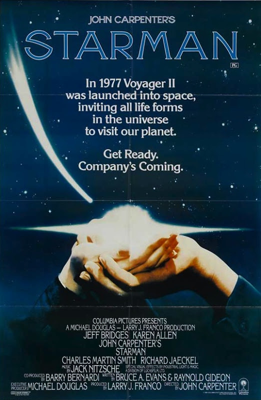
Yeah, I know. Both of these are very close in design to each other. But, version 1 at the top was the more bare preview representation that added to the mystery of Carpenter’s sci-fi film. Below, the version 3 graphic brought the hands into play, which worked well with the motif the director deployed, wonderfully I’d add, in the production. Believe it or not, my absolute least favorite is the one most people are aware of.
Big Trouble in Little China (1986)
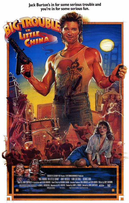
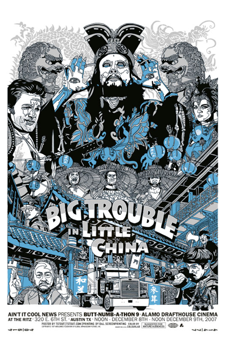
The topmost is the one-sheet we’ve all come to know and love, although there was a very similar ‘B’ style that wasn’t bad, either. It remains the gold standard. I’ve come to appreciate the latter alternative, as well. In a similar style of the fan poster for The Thing, this later hand drawn depiction was simply splendid. But what I really value it for was its showcase of the great James Hong as the villain David Lo Pan. So frickin’ cool.
Prince of Darkness (1987)
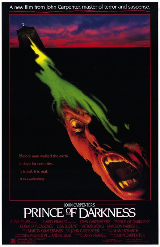
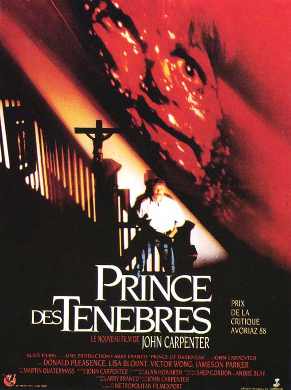
I know there are other variants out there, a few fan-created, but for me I still prefer the U.S. ‘A’ style sheet at the top. It’s dark colors and mysterious imagery were unsettling, in a good way, and remain an effective composition all these years later. Nevertheless, the French version at the bottom offered an interesting contrast that was still a little unnerving in what it previewed1.
They Live (1988)
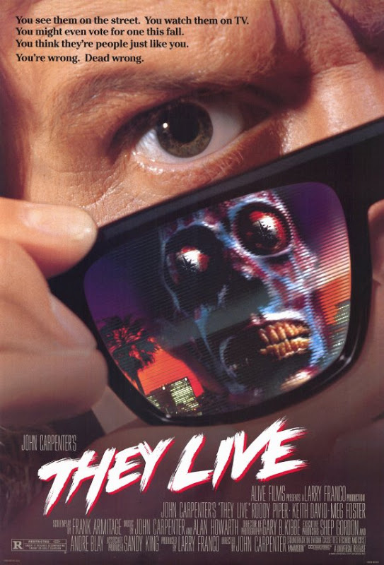

I think its safe to say that the topmost, the initial style ‘A’ variant, will be the most recognized poster for this John Carpenter film. Like the highly underrated late-80s film, the design of it was undervalued for years. It really was an intriguing graphic (care of the glasses). Have to say the later Blu-ray/DVD cover was a tad too hectic, especially when compared to say the Spanish poster (above) that offered a more diverting variance.
Memoirs of an Invisible Man (1992)


There really wasn’t much graphically for this Carpenter film, one that gets little in respect. While it’s not among the director’s best work, it’s sold way too short by many. The style ‘A’ poster doesn’t draw much praise either. Imaginative it’s not. Perhaps, the little seen preview poster on the bottom offered a more compelling take, but I doubt I’ll convince many others. Moving on…
In the Mouth of Madness (1994)

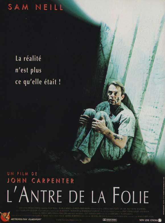
As clean as the U.S. ‘A’ poster was for the last film in what became known as Carpenter’s “Apocalypse Trilogy”, as depicted with the top poster (and most of the studio variants), its visual literature allusion was a bit too literal. Not bad, but not great either. What I really love was the look on Sam Neill’s face with the French version. It’s stark and somewhat staggering with what it captured, and so I prefer it.
Village of the Damned (1995)

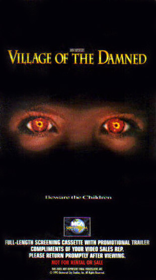
You…in the back…yeah you, I can hear your snickering. This remake of a British classic is probably the least loved among JC’s work. Just like Memoirs… I don’t believe I’ve ever seen a different version of the style ‘A’ poster, or others. So we have the Giant Floating Head motif that became cliche ages ago — oh, yeah…this was made in the ’90s. I think I prefer the bottom VHS cover now that I think on it.
Escape from L.A. (1996)

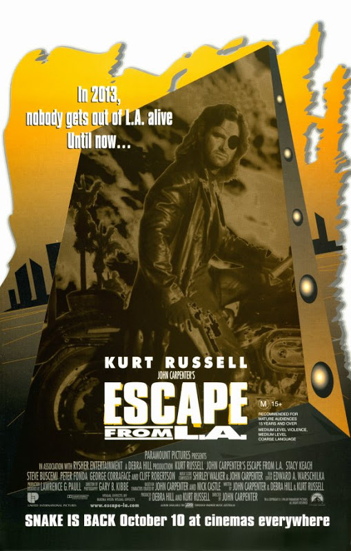
The ‘A’ poster for this beleaguered sequel, what I believe was an sold short satiric film by Carpenter and longtime collaborator Kurt Russell, offered a striking contrast to the original’s dark poster theme. I lean toward the layout of the quad ‘B’ version, myself. Still, the Australian graphic at the bottom may be my favorite for Snake’s sequel as it toned down the color, but still kept the design…and the attitude.
Vampires (1998)
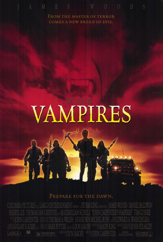
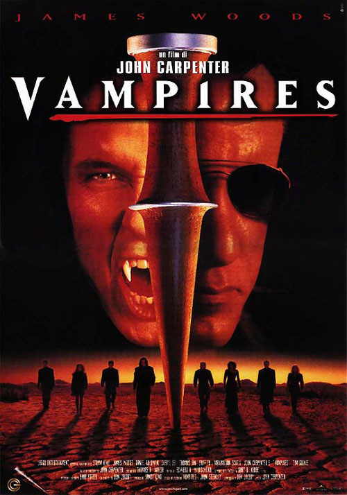
By this time, all of the studio traits in poster design started to wear thin. A silhouette of the principals in front of the sky…or ocean…whatever, with a threatening face floating in the clouds (along with the title, depicted in blood-red), and you get where this was going. Ugh. Then you look at what some did with later DVD covers (like the one at the bottom) and that ‘A’ poster starts to look pretty decent after all.
Ghosts Of Mars (2001)


The U.S. movie posters were all variations of the first one-sheet here. Again, Carpenter got stuck with what studio designers thought fit in some formula. Damn Adobe Photoshop to Hell!!! Okay, maybe it’s not that bad, but it was not very stirring either. However, the French design on the bottom was so much better, in my opinion. No question, a better graphic overall for the sci-fi western the director walked away from movies with.
The Ward (2010)
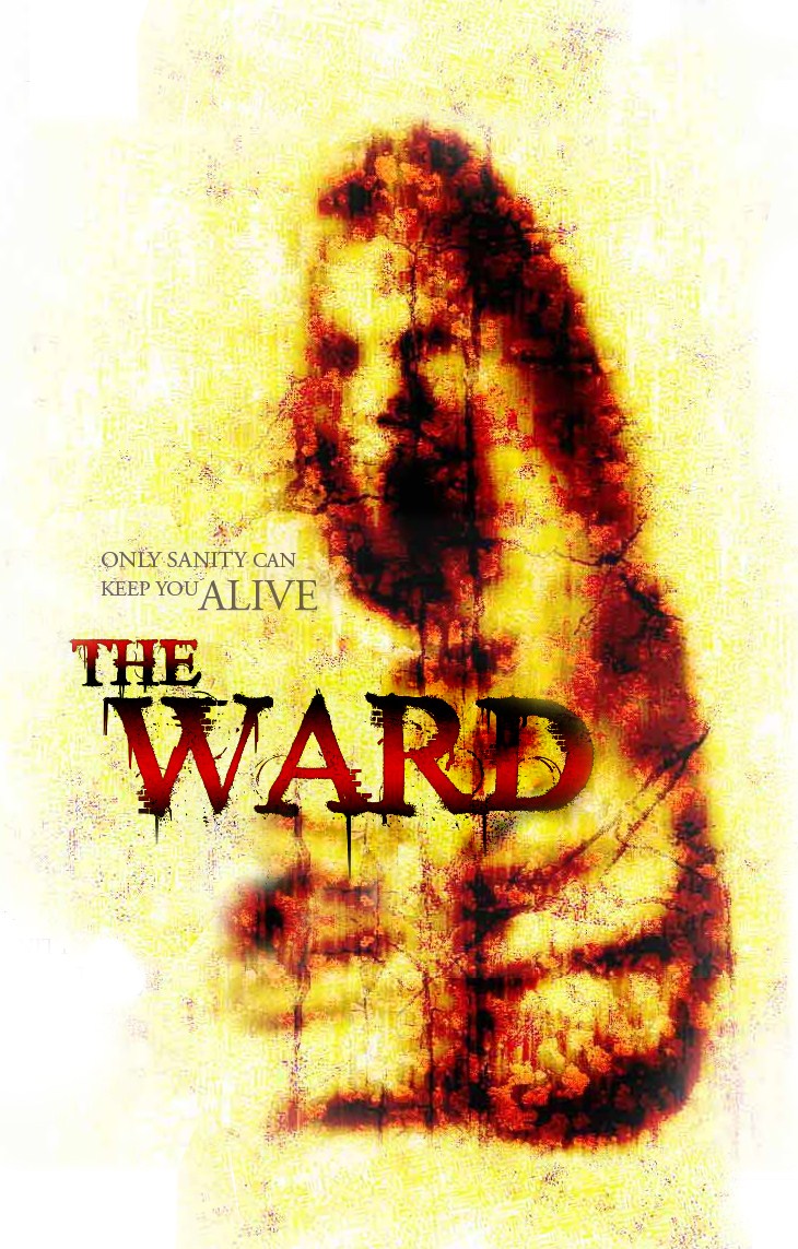
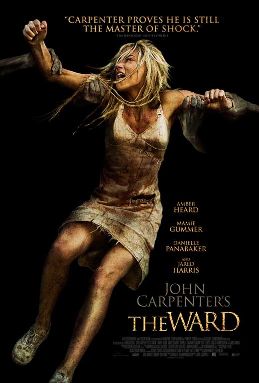
For the Master’s return, poorly reviewed by critics but appreciated by his longtime fans, the stifled U.S. theater release got a strangely designed poster graphic (top). Kinda intriguing, yet unclear and to an extent, muted. Contrast that with the UK’s (which saw the film before us) with their style ‘A’ sheet and you see why subsequent posters and disc covers used it. Instantly challenging, it’s fitting to what John Carpenter’s work has always been.
- Let me go on record as saying the later DVD cover for Prince of Darkness was a graphic travesty (as has been the case with disc media of late), no insult to Alice Cooper, however. ↩

5 Responses to “Reprise » Works of Art – John Carpenter Film Posters”
Great post! I love these! 🙂 I have an ongoing “John Carpenter Project” as there are too many big films of his that I’ve never seen. Hope to review them all by the end of the year. Anyway, I only just watched Escape From New York for the first time. Loved it!!! 🙂
LikeLiked by 1 person
What a great project! You’re in for quite a treat. Many thanks and good luck with your venture, my friend.
LikeLiked by 1 person
Man oh man, I love this!!
LikeLiked by 1 person
Glad to hear it. Many thanks, Mark. 🙂
LikeLike
[…] secret John Carpenter’s The Thing is one of my all-time favorites. So when I received a recommendation to read a Jim Hemphill interview of Dean Cundey, th early […]
LikeLike