
Best Album Covers: Undercurrent
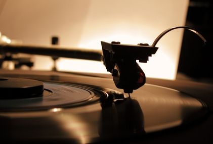
This is the next entry in Best Album Covers, a series begun right here. The first successful long-playing microgroove record for the phonograph was introduced by Columbia Records back in June of 1948. Yet, album covers (the paper board packaging that held them) didn’t come into their own graphically till decades later. Eventually becoming the cultural stamp on the music of the time. Catching the eyes of potential record-buyers and later their ears and minds. Melding the musical experience with the artist into a unique visual form.
Why Compact Disc versions of album art don’t exactly raise the same reaction these days was looked at in this post. Although, music label artistry continues to be noticed and discussed among the material published today. The bits and bytes are looking over their shoulder, though, because vinyl hasn’t entirely gone the way of the dinosaur. Online or at the record shops still out there. Cover art hasn’t lost purpose, either for old and new. Mostly, it’s my contention while digital reigns supreme, its vigor among fans lacks the tactile passion of the past LPs.
Hence the reason for this series. Some register more with me musically than others, though. Yet, the artwork will always take center stage, at least here. Let’s continue shall we?

“Other than four piano solos from April 4, 1962, this set was pianist Bill Evans‘ first recordings after a hiatus caused by bassist Scott LaFaro‘s tragic death in a car accident. The first of two meetings on record in a duo format with guitarist Jim Hall, the collaborations are often exquisite. Both Evans and Hall had introspective and harmonically advanced styles along with roots in hard-swinging bebop. There is more variety than expected on the fine set with some cookers, ballads, waltzes, and even some hints at classical music.“
Whether you are a fan of traditional, some would say timeless, jazz recordings, this album remains a sublime experience for listeners. One that well represented the stellar pairing of Bill Evans and Jim Hall. A work Robert Hutton described as, “A classic of neo-classical, elegantly understated chamber jazz.” Even though my tastes tended toward the later variant of Jazz Fusion, I remain a fan of this LP.
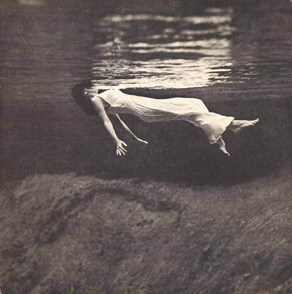
Admittedly, black & white photography has influenced a number of my selections for this cover art series. This one is no exception. The image used for the front cover of their Undercurrent album was initially captured by the famed American photojournalist and fashion photographer, the late-Toni Frissell. She was a staff photographer for Vogue, Harper’s Bazaar, and Sports Illustrated. Shot war and models, with equal skill.
The iconic photograph titled Weeki Wachee spring, Florida was first published in Harper’s Bazaar, December 1947; later in Sport’s Illustrated, 1955.
Her image displays the underwater view of a woman, wearing a long white gown, floating in water. It’s eye-catching for its distinctly dreamlike visualization. An elegant figure, her face obscured, hovering just beneath the surface, in a state that could almost be depicted as bliss. An indescribable feeling we are left to imagine. No wonder the graphic designers at United Artists reused the photo to gather the eyes and ears of listeners.
Some Compact Disc reissues include four bonus tracks, including two alternate takes and previously unheard versions of “Stairway to the Stars” and “I’m Getting Sentimental Over You.” ~ Allmusic
Artist: Bill Evans and Jim Hall
Title: Undercurrent
Date: 1963
Label: United Artists
Track Listing (and yes, turn that record over):
Side one
- “My Funny Valentine”
- “I Hear a Rhapsody“
- “Dream Gypsy“
- “I’m Getting Sentimental Over You”
Side two
- “Romain“
- “Skating In Central Park“
- “Darn That Dream“
The entire series can be found here.

7 Responses to “Best Album Covers: Undercurrent”
What a shot! Great cover, Michael. Fun post.
LikeLike
Thanks, Cindy 🙂
LikeLike
Hi, Michael:
Very ahead of its time album and kind of creepy cover photo.
Am I the only one flashing back to variants of Charles Laughton’s Night of the Hunter and Coppola ‘s very early Dementia 13 ?
LikeLike
Interesting observation of Frissell’s photo, Kevin. Now that you mention it, I can see those connections. I’m thinking of Candace Hilligoss emerging from the water in Carnival of Souls because of it. Thanks, my friend 🙂
LikeLike
Huge props for connecting one of cinema’s more notable heroine’s in a criminally overlooked film I consider required viewing, Michael.
Very well done!
LikeLike
Glad to hear you’re a fan of that notable Herk Harvey work, Kevin! Thanks, my friend.
LikeLike
[…] of album designers, as noted, have retasked well-known photographs (see examples 1, 2, and 3) to make statements or elicit reaction. Relevant for original illustrations, as well, and […]
LikeLike