
eBm: My Top 13 List of OO7 Posters
Richard, who runs the delightful Kirkham A Movie A Day blog, came up with a fantastic idea regarding movie posters for what is arguably the greatest film series running, James Bond. Not only did he share a picture of his collector’s poster that greets visitors to his home (mine is the image above), but created an exceptionally fine list with his 007 Posters / A Top Ten List last week:
“Last year in all the hubbub around the release of Skyfall, I put up several lists of Bond related rankings. The blog-a-thon I participated in includes dozens of other posts that I shared. Many of those ranked the Villains, Title Songs or Bond girls. I don’t know why it never occurred to me that a poster ranking would be a ripe subject for me. My Blogging friend from Long Island, Eric, suggested this to me the other day, and I smacked myself on the forehead wondering why it had never occurred to me. I have two or three books that cover all the Bond posters, and publicity material and I am an avid collector of posters myself.”
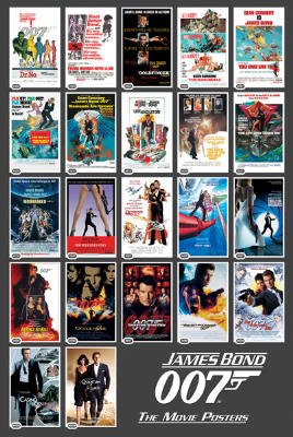
If you’re a Bond fan, like me, this was a must-read. I recommend it. So much so, any great idea is one worth stealing, I’d say. 😉 I immediately thought to pick my favorite number of the same here, purely as another arcane exercise in my excessive Bond minutiae (eBm™, for short), as I did once before. Like Richard, I’d open this up to the gamut available in the graphic catalog that I’d gather:
“Most of them have a teaser poster, which appears in theater lobbies several months before the film arrives. That is usually followed by an advance sheet, sometimes referred to as the “A” sheet, which usually has the main artwork and tag lines for the movie. When a film actually shows up in theaters, there is a “B” sheet that is a slight variation of the “A” but includes contractual credits and refinements of the artwork. Once reviews appear, then the posters get modified with blurbs from critics. Finally, there are character posters that have become a trend in the last twenty years or so, each poster featuring leading characters from the story.”
I have no shame. 😉

#13 Die Another Day

Richard said it eloquently of this elegant teaser poster featuring a smoking silenced gun (for a film that hasn’t aged very well), with wonderful photography by T. Keller:
“I like the effect of the gun, hot from recent use, melting into the block of ice. It suggests action without showing any. The ice theme is a big part of the film, both in reference to one of the locations but also to the use of diamonds as a Maguffin.”
#12 Casino Royale (1967)
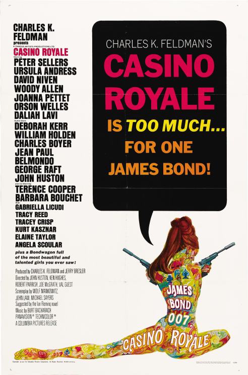
As I mentioned to Richard, I’d look at this strictly graphically, poster-wise as a fan and not let my feelings toward the film (good or bad) get in the way. This would be the fruit of that as I have little warmth toward this 1967 spoof, but its poster sure made my list. It’s said Orson Welles attributed whatever success the film achieved to the studio’s scheme to feature a naked tattooed lady on the film’s ad campaign. Illustrated by the famed Robert McGinnis, it remains the single best thing in the entire movie.
#11 Goldeneye

Yeah, it whacked perspective something awful as it gave the impression newcomer Pierce Brosnan was holding the gun right next to his own eye. Still, the gun and the man holding it, gathered your full attention and focus (in a pose and motif the U.S. one sheet mirrored). Even the small detail of the rifling in pistol’s barrel drew you in. The sepia tone photo, by Terry O’Neill, concealed most of the new Bond’s face for mysterious effect, offered a dramatic background that also set off the iconic OO7 gun logo, in red.

Let’s continue with some more stark photography, this time by Greg Williams, and one where a mere image spoke volumes. I love the shot in the 2008 teaser poster for Daniel Craig’s silhouette and second outing that’s overly maligned, The Quantum of Solace. The prominent dark form immediately harkened back to Casino Royale‘s last scene, where Bond becomes…Bond. The HK UMP-9 submachine gun instantly recognizable. Pitched against a worn, cracked, and bleached out pavement, it offered a tantalizing preview in what lay ahead for OO7.
#9 Octopussy

Even though there is another Roger Moore-era poster I rate higher than this, Moore as James Bond never looked as sophisticated and in character as he did here (in a film I still like, and the one he should have retired on). Damn, was he made to look good, as depicted by artist Dan Goozee, and with a clever tagline (repurposed from The Spy Who Loved Me theme song). Richard:
“Like an eight armed Shiva, Octopussy is embracing and threatening to Bond at the same time. The Shiva like reference and the costume hint at the locations for the film, without coming right out and saying India.”

Once again, a silhouette powers a poster, though this time in graphic contrast. Richard described why this gracefully stylish Randi Braun, Diane Reynolds, Vincent Patterson design was so captivating as the U.S. advance poster:
“The reverse silhouette of the girl in the flames, surrounded by a black background is amazing enough, but then you notice the figure of James Bond, posing in the traditional gun in hand position and it becomes something even more. Bond’s outline and the girls, merge to form one of the few photoshop style designs that have ever been used on a poster that I liked.”
#7 Dr. No

It was the American artist and illustrator Mitchell Hooks who delivered to the world our first glimpse at a nicely stylized Sean Connery as OO7 on the 1962 Dr. No poster. We haven’t been the same since. Known for his paperback covers, Hooks created the striking illustrations for James Bond with the UK quad poster, which would be retasked for this later U.S. theatrical version, and repurposed for the international posters to come. Very much old school, it featured beautiful line-art illustrations fused with those wonderfully posed colorful characters. A splendid overall effort. The added OO7 gun logo never more prominent than it was here.

For those unaware, this poster’s tagline was the producers’ response and putdown of the spoof Casino Royale out the same year — as if any Connery fan had to be told. I really appreciate Robert McGinnis’ and Frank McCarthy’s U.S. ‘A’ poster with its truly wild depiction of OO7 taking the unthinkable stroll around the top of SPECTRE’s spectacular volcano base (my favorite villain headquarters, btw). In familiar gun pose, at that, it’s the craziest selection on my entire list, but stood out because of its startling and detailed artwork. The bifurcating “Twice” in the movie title another reason I love it.

This was my colleague’s top pick, and it remains a great one, indeed. James Bond graphics-vet Robert McGinnis’ stylish return to the fold with the melding of the Tarrot cards in betwixt the character and elements in the film was simply top-notch. Richard:
“This was Roger Moore’s first Bond film, and the graphic designer took advantage of his first and last names, to again utilize the 007 icon. They also used a dagger in the title to suggest the danger in the film. …on top of that the artwork is just gorgeous.”
#4 Goldfinger

I agree with Richard that “…the black background and the gold highlights look great together” for Goldfinger‘s ad campaign. A nude Shirley Eaton, simply dazzling in gold paint, remains an iconic figure of the 60s. Yet, I’ll go with a variation on the UK quad by Robert Brownjohn as my matching pick. His photographic approach for the third film in the series a wonderful change-up as it depicted Connery and Honor Blackman projected on the doomed model’s gold-painted arm. The image emerging from a stark black milieu was the height of intriguing. I happen to love the title’s outlined Clarendon Black font use, too.
#3 Thunderball
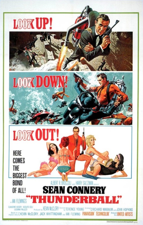
After mom’s brother, my uncle, went and changed my life — all on account of Goldfinger — this became my most anticipated film in the months afterward. I think it’s a natural meeting of the liked-minded that Richard and I finally match up with this film’s poster. The illustrations, going across three stacked, distinct panels of action and allure, are pure fan candy. It’s so good that if the film was turned into a graphic novel today, by these artists, I’d buy it. Richard:
“Frank McCarthy and Robert McGinnis did the artwork. Special kudos to McCarthy on the Jet Pack painting, it is spectacular work.”
#2 Casino Royale (2006)

The teaser movie poster that really introduced Daniel Craig to Bond fans — I think the producers’ 2005 press conference in London that presented the sixth actor to play the OO7 character fell a tad flat. This did not. Richard’s take on Greg Williams stellar work spot-on:
“The lighting of the shot sets an ominous tone for the film. The poker chips combined with the title remind us that it is a gambling theme that will be the focus of our hero’s conflict. The gun laid out on the gaming table tells us that the stakes are more than money.”
The bold Century Gothic Regular font, with a distinct shimmer and specifically modified Os used for the movie title, cast against Bond’s black tux, topped it all off rather nicely.

While the U.S. movie ad campaign featured info-based posters, the UK’s set a standard not only for bold illustrative design (c/o Brit Eddie Paul and the Italian-born Renato Fratini) but also was the progenitor for the handgun posture every James Bond fan knows (and imitates) today. It was with this poster, and its quad, the pose became the famous and identifiable OO7 image, even if it’s not a Walther PPK in hand. Wonderfully proportioned, the women figures and elements from the film never more seductive, its vibrantly colorful artwork was simply audacious. The wicked-looking Connery, the titles nicely tilted to work well against his black tuxedo, gave you the once-over to grand effect. Nothing has looked like it before or since.
I know I’ll get some mention for and about Skyfall, so here is my favorite of the recent set:

Most of the gun-barrel views and individual character posters (seen here) I didn’t much care for. This one was clean, denoted action, and used the white space effectively — Craig nicely positioned and cropped. But Bond’s black tux, set against a white background and the black OO7 gun graphic looks a faded navy. Maybe they were going for that look. Meh. And why oh why have the gun logo in two places on the sheet? Yep, I’m too damn picky. 😉

30 Responses to “eBm: My Top 13 List of OO7 Posters”
What, no love for MOONRAKER? That film’s poster told us that, “Outer space now belongs to 007.” (Take that, George Lucas!)
Great list, nicely done.
LikeLike
Ah, Jaws floating weightlessly and menacingly toward our man Bond.
Hehe… Thanks so much, John.
LikeLike
The For Your Eyes Only (1981) poster stands out in my memory for its, uh, cheekiness. I love your choices though: Thunderball and You Only Live Twice are classics. Awesome post!
LikeLike
It is indeed eye-catching, John
Thank you very much, my friend 🙂
LikeLike
Great list, so many to choose from. I think I would pick Octopussy as my favorite.
LikeLike
It is indeed a great one, Chris. Many thanks, my friend.
LikeLike
Thanks Michael, I love your choices as well. The 1967 Casino Royale Poster is the only thing that felt “Bond” like about that movie. I appreciate your including my comments in your post.
LikeLike
It was the least I could do for the guy I ‘borrowed’ from ;-). And yes, that ’67 poster for the spoof was the only thing Bond-like. Thank you very much, Richard 🙂
LikeLike
If this was a vote I’d throw in for Daniel Craig’s Casino Royale. Slick ‘a poster as you’ll see.
LikeLike
Welcome, Patrick! It is indeed a slick one. Thanks for the read and comment :-).
LikeLike
Awesome post!! I’m not as fond of the older Bond posters, though that was the style of the time. My faves are from Casino Royale, perfect combo of classy and cool, great way to introduce Craig. I quite like the one from Licence to Kill (http://www.originalprop.com/blog/wp-content/uploads/2009/03/james-bond-licence-to-kill-one-sheet-poster-x2000.jpg)for obvious reason 😉 I mean Dalton looks so bad-ass an utterly believable that he indeed has licence to kill & not afraid to use it!
LikeLike
You know the highly and criminally underrated ‘License to Kill’ is my favorite Timothy Dalton Bond picture. Its poster is a worthy one.
Always appreciate your Bond thoughts, Ruth. Thanks for the contribution, my friend :-).
LikeLike
I support many of your choices, big cat. For me, the Dr No poster and the Thunderball posters were the best of the Connery era. And Octopussy is my favorite Moore poster. I wish they’d go back to using art for these modern films… they would be so cool!
LikeLike
You know it, Fogs. I’d love to see a throwback-styled poster for the next Bond flick. The poster illustrations by these artist were somethin’. Great to have your thoughts, my friend.
LikeLike
Great post! Octopussy & For Your Eyes Only are probably my favorites although the McGinnis stuff is great.
LikeLike
Can’t argue against those picks, Colin. Great to find another who appreciates McGinnis work. Many thanks, my friend.
LikeLike
I’m not really into Bond but I’m throwing in my vote, too. My faves would be the more recent Casino Royale, Goldfinger, and Goldeneye.
LikeLike
That’s a fantastic threesome, Rachel. Glad to have you join in! Thank you very much :-).
LikeLike
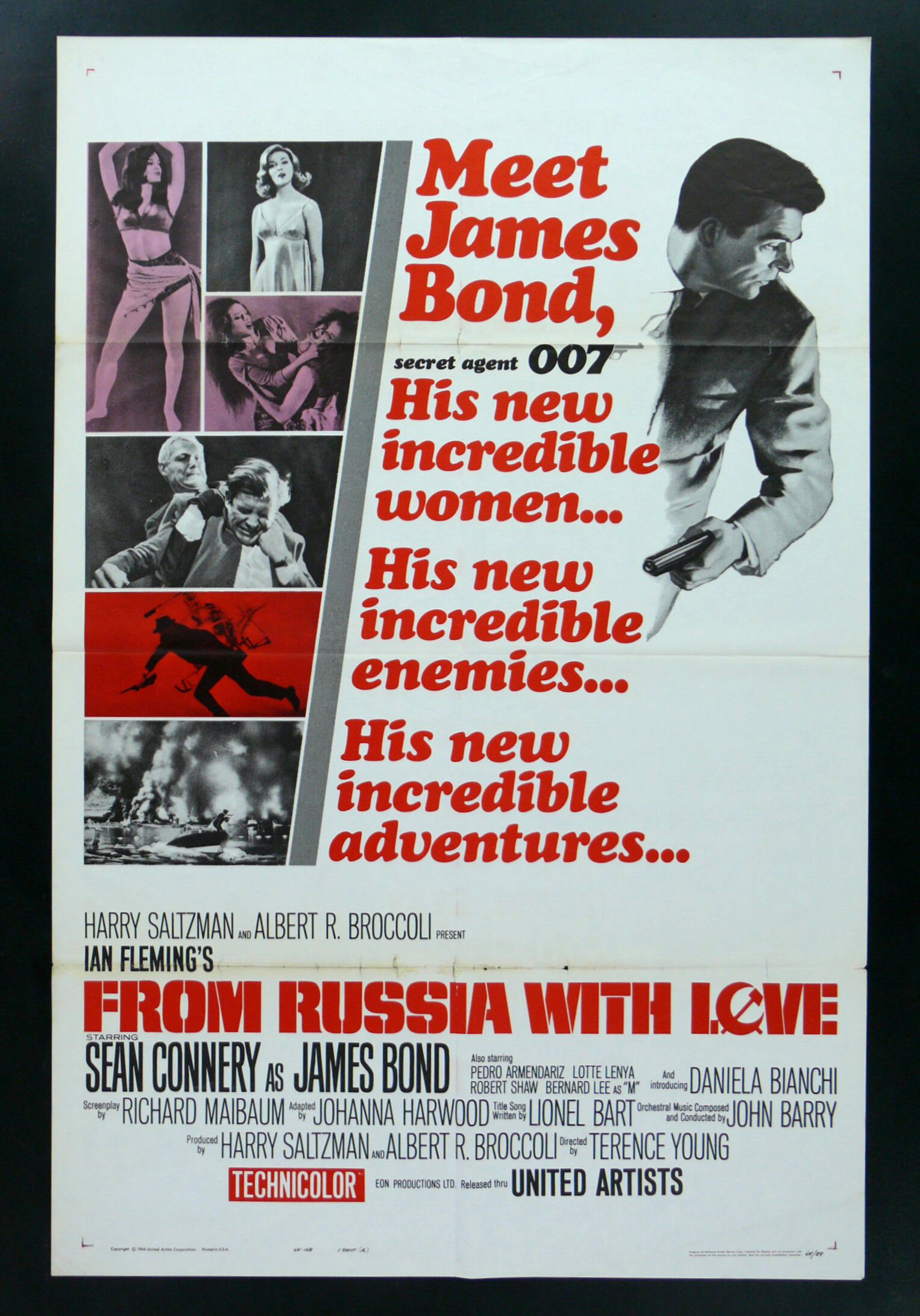
Nice list. From Russia WIth Love’s my favorite Bond poster as well.
LikeLike
Yay! Thanks so much, my friend.
LikeLike
Where do I find this poster to buy? I can only find the quad.
LikeLike
Hi, Michael:
Still the first and top of the line in visuals!
Show me another entrance that was as… dramatic as Ursula Andress’ Honey Rider and her rising from the washing surf.
Okay. Maybe “dramatic” isn’t the right word. but it WORKS!
Also, the best use of Jack Lord as Felix Leiter in any Bond film.
Not a lot of gizmos, though appropriate flash.
Oh…. And the poster rocks too!
LikeLike
Ah… Ursula Andress as Honey Rider rising from the washing surf. So damn memorable, and dramatic. It did indeed work! Great to have you OO7 thoughts, Kevin. Thanks, my friend 🙂
LikeLike
Your top three are pretty amazing, I am always a fan or artwork over pictures (for the most part). I think Thunderball appeals more to my comic book style that I like, it gives the movie a pulp look in a way. Great list!
LikeLike
Sorry it’s taken me so long to reply, my friend. Thank you very much, mummbles :-).
LikeLike
[…] “There are movies that you know instantly are great as you watch them…” Richard, who I’ve spotlighted some weeks ago for his Bond poster article over at Kirkham A Movie A Day, is now a regular contributor over at another fave site of mine, […]
LikeLike
Where the hell do I buy the From Russia with Love poster? Been looking forever and can’t find it? Do you know where?
LikeLiked by 1 person
Welcome, amitku53 :-). Oh, I wish I knew! It’s the one I’ve longed to have in my possession. Thanks.
LikeLike
Where do I find the From Russia with Love poster to buy? Can’t see it anywhere besides the quad.
LikeLiked by 1 person
If you find a source, I hope you share it with me. I’ll do likewise 🙂
LikeLike